Friday, November 22, 2013

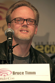
Animator Post: Bruce Timm


Born on February 8, 1961, Bruce Walter Timm is an animator, character designer, and producer. Bruce Timm is my favorite artist of all time! Essentially, the cartoons he helped create span my entire childhood, and become the subject of nostalgic conversations with those of my generation. It is hard to believe that so many of my favorite cartoons are in some way related to this artist. He co-created, worked on, or produced my favorite cartoon shows growing up (ones that I still, for better or for worse view regularly) including Tiny Toon Adventures, Batman: The Animated Series, Superman: The Animated Series, The New Batman Adventures, Freakazoid! Batman Beyond and Justice League. I was inspired by the way his rather simple angular character designs came to life so vividly through the remarkable storytelling of each episode.


If any single moment can be tied to my decision to become an animator, it is a particular episode of Tiny Toon Adventures, where the cast peers into the world of creating cartoons. There are two episodes, actually. The very first episode chronicles a failed cartoonist's quest to create a successful cartoon, and he receives help from the Tiny Toons crew.

This image is a compilation of Superman: The Animated Series and The New Batman Adventures 


From Batman: The Animated Series
From The New Batman Adventures


It is interesting to see the progression of his animation and character design throughout the respective series. The New Batman Adventures is noticeably more minimalistic than Batman: The Animated Series, for example.With Batman from the two series Batman: The Animated Series and The New Batman Adventures poised side-by-side, it is clear, as it was even during my childhood, that Timm's style had become more minimal. There is less visible detail in Batman's costume, with highlights largely absent in the cowl, boots, and gloves. His muscles are also less detailed.Similar examples of decrease in detail can be found in Timm's animations of The Joker and Catwoman from the transition of the two series. I am grateful for the experience of witnessing the evolution of Timm's style as it took place.


It is remarkable to see that Bruce Timm was able to convey comical, lightheartedness and serious action with equal conviction.To have worked on a series as dark as Batman: The Animated Series, where allusions to character deaths and violence abound, and yet to have worked on something as frivolous as Freakazoid! or Tiny Toon Adventures displays an impressive range of thought and creativity.

Timm's original ambition was to become a comic book artist, although this did not come to fruition to the extent he intended. He did, however, produce a comic mini-series based around Batman: The Animated Series, as well as a transition between it and The New Batman Adventures entitled The Batman Adventures: The Lost Years. These comics maintain the styles of their respective television shows, which their stories often parallel.

I cannot adequately express the profound impact this artist has had on my life. Should I ever become successful enough for others to write about me, they must cite Bruce Timm as my key inspiration.
Sunday, November 3, 2013

Reading Response: Identify Yourself: Output

Identify Yourself, written by Krystal South, is an article designed to highlight the unique role that technology plays on personal identity. Beginning with a fascinating assertion about the nature of technology in a manner that differentiates a computer's decision capabilities from human choices, South insists that humans are fundamentally different, and must operate on  a higher plane of interaction. South transitions into several interesting and noteworthy points about our interaction with technology, including our ability to adopt a false internet personae and incorporate taxonomy, and the point I found most interesting is our ability to present ourselves, be it thought or talent, and receive feedback.

This section, entitled Output, was remarkably simple. Beginning with a personalized aspect of this topic (as the right side of this article appears to exclusively feature) South commented on the powerful ability to post thoughts or works that may receive internet feedback. I have personally seen quite interesting results from this as well. I recall making a post on Martin Luther King day in which I shared a dream of my own, one intended to reflect a modern day version of King's ideals motivated at current inequality issues. It was perhaps the most popular thing I've ever posted to the internet, in that people felt the need to share my idea, and individuals I have not seen in years, even those whom I've never met, took the time to like or comment on this post and share their thoughts. As South notes in this section, there is also the possibility of negative feedback, which I quickly found out about. While Facebook, the social-media vehicle through which I chose to express myself, does not also for a dislike option, as YouTube and others do, it still allows users to post an objection and receive likes for that comment. I soon learned that there was a vocal community of those who felt as though my comment had gone too far. I was then faced with a choice, one that South explains in the highlighted portion of this section. We have the ability to eliminate disagreeable feedback on such social media. There were several courses of action that I could have taken: I could have removed those who objected from my friend list; I could have deleted their comments; I could have blocked them from making future comments.

With our ability to choose, monitor, and filter output and feedback to said output respectively comes the inescapable responsibility we have to what we post, fail to post, and delete. While I could easily delete persons and comments from either my friend lists or posts, there comes with such action the repercussions from the remaining community.  Deleting friends and comments puts the surrounding community on edge; they may feel as though they must censor themselves in order to communicate with me. There can also be positive and negative feedback for the frequency with which one posts. Failure to tweet every few days may result in someone unfollowing you, while tweeting every few minutes every day may result in just the same. In this way, such communities serve to not only provide feedback for what we post, but how often we post, in addition to providing feedback to our feedback. I ultimately deciding to allow the dissenting opinions to be posted on my wall, and keep my controversial comments to a necessary minimum. This is not the compromise suggested by some, who thought that I should unfriend these individuals, but it is the one that allows me the opportunity to post my thoughts to those who disagree and encourage mature dialogue, though some take the initiative to unfriend me. This is all to say that there is a complicated and intricate relationship between output and feedback, one that, as South suggests in the beginning of the article, requires a human emotive response rather than a mere mechanic rational one.

Thursday, October 31, 2013

Finished Portrait


Here is the finished portrait of CM Punk for the project. Also, since no one appears to know who he is, a small taste of him and his personality can be found here.

Thursday, October 24, 2013

Vector Artist: Beto Garza


Mexican artist Jesus Alberto Garza Lopez is known on the internet as Beto Garza. I was drawn to his work due to his quirky style that is both comical and intentionally bizarre. Very little is known about this artist. He doesn't have a wiki, and very little can be found about him, other than the artwork he produces itself. As for his artwork, it is very reminiscent of Pop Art. He draws references to various popular cartoon characters and magazine covers, in addition to what appear to be his own creations.

I was particularly intrigued by this work because of its title "Think Digital" which immediately reminded me of this class. Much like our first project, this piece emphasizes human dependence on technology, and almost seamlessly blends the two together. In a sort of irony, everyone's faces and gestures appear to indicate happiness, yet there is a dark overtone to the piece. The two men at the top have some sort of camera instead of a face, indicating that we are being watched at all times. The radial quality which is also visually interesting, centers around Danilo Black, inc., a media design studio. Everything that everyone does in this piece feeds back into this company, which suggests that Beto Garza holds a very negative attitude towards them. The piece is subtle and sarcastic.

This was the piece that first captivated me. After seeing it, I just knew I had to choose Beto Garza, regardless of how difficult attaining information on him might be. This is perhaps due to the central figure and his appearance of royalty, which connected me to my character in the Art for Video Games class.Here, a central figure wears a crown and dress so as to indicate that he is a prince or king, and is surrounded by individuals that are looking at him. The piece is flat and abstract, yet a sense of depth is created, not only from the implied positions of individuals being in front of and behind one another, but by the patterns in the background and on the two individuals who appear to fawn over the central royal figure most. In the background are demonic figures, two of whom appear to view this king critically, and the remaining who appear to concentrate on the viewer. Overall, the use of bright colors against a mostly black background, the facial expressions on each character, and the radial quality of this piece help to make it very compelling and effective.

Wednesday, October 16, 2013

Project 2 Progress: Best in the World


Here is the progress I've made so far. As should be immediately apparent, I changed my portrait from last time in favor of this guy. This is WWE superstar CM Punk, who calls himself the best in the world. I like his tenacity and forthrightness, so I find it very fun to work on him. I feel that the project is coming along well from the original photo, which can be seen below. Of course, it still needs much more work.


Saturday, October 5, 2013

Artist Post: Sonya Rapoport


Art, Code, and the Engine of Change by Paul Hertz featured a number of artists as it described the interesting and arduous process by which digital media transitioned into the art world. Among the featured artists was one whose artwork caught my eye: Sonya Rapoport.

Mills College puts it succinctly: "  Sonya Rapoport is a distinguished artist whose sixty-year career spans painting, works on paper, interactive installations and digital works." Her wide range of mediums and experience make her one of the greatest artists alive today. At 89 years of age (turning 90 tomorrow, 10/06/2013), she maintains a blog which can be found here. The purpose of her blog, in her own words, is to "re-appropriate former work and to re-contextualize it into current events, topically, politically, and/or conceptually."

 Even more intriguing than the artwork entitled Shoe-field was the description of how it came about. Hertz reported "Shoefield by Sonya Rapoport represents physical and emotional data about people's shoes gathered at a 'shoe-in' in a series of graphs, including a force-field map graphing the similarity of responses as magnetic domains." One can reflect upon the significance of his or her own shoes, the journeys undertaken in them, or the memories of how they were obtained, and instantly draw deep significance. Shoefield is, in this way, far more than the mere collecting of graphed shoes; it is the expression of dozens of lives and stories.


Monday, September 23, 2013

Artist Blog: Aaron Koblin


Aaron Koblin, born January 14, 1982, is an American Digital Media Artist, specializing in data and digital technologies. He leads the Data Arts Team in Google's Creative Lab in San Francisco and has collaborated to produce Grammy nominated works. Website thefader.com declares Aaron Koblin to be the next Steve Jobs. Koblin, a bit more modest, refers to himself as "50 percent nerd, 50 percent nerd/geek" and "trying to fuse those worlds together" (https://www.youtube.com/watch?v=jzDRtncZXKg). One remarkable feature of Koblin's artwork is the ability to contribute to its creation. As will be displayed through the two works in this blog, Koblin allows, and expects his audience to contribute to his work. This no doubt is more effective than most artwork in terms of its ability to capture the viewer's attention. With a world of constant visual stimuli, it is far too easy to ignore artwork, particularly if the information is difficult to decode, but this applies even to fairly good artwork as well. To be truly captivating, artwork must be engaging, yet non-intrusive, lest it become merely annoying. Koblin achieves this delicate balance through his work.


The Johnny Cash Project drew inspiration from my favorite Johnny Cash song "Ain't no Grave", and is designed to display the immortality of Cash's legacy that far exceeds his time here on earth. He partnered with Chris Milk, an American music video director, in the making of this project. The link to the Johnny Cash Project can be found here.


The Wilderness Downtown, also collaborated with Chris Milk, is an interactive film that allows the user to enter their home address and see a customized video featuring their neighborhood as the setting while "We Used to Wait" by Arcade Fire plays. Having watched the simulation myself, I can confirm that the video indeed will feature precisely the location that one enters. In this way, the piece functions in an autobiographical way; through the mere entering of a few keys, one is able to view a song narrative of their house, old house, place of employment, location of a special memory, etc.

I sincerely hope and expect to see that thefader.com's prediction is correct, and we are indeed viewing the artwork of the next Steve Jobs. If so, rejoice in the fact that you saw it here first. If you'd like to see more of his amazing work, or get more information about locations where his work is displayed, please visit aaronkoblin.com

Sources: aaronkoblin.com; thefader.com

Tuesday, September 3, 2013

First Blog: Nancy Burson's Human Race Machine and Beauty Composites


Nancy Burson was born in 1948 and is best known for the morphing technique, wherein Burson uses computer technology to generate transformations of the human face. She is quite well known for using such machinery to simulate transitions in race, age, and facial features to generate both aesthetically pleasing works and those which challenge our notions of beauty and ugliness. Her mastery of digital artwork is immensely helpful generating ideas and inspiration.

The Human Race Machine is one of Burson's most famous works, and is even featured on her website. It was designed with the intent of diminishing racial tensions by adding an element of personal belonging to each race, rather than portraying one or more races as "the other". I find this work to be a powerful means of unifying humanity and blurring distinctions based upon skin color. The design is as ingenious as it is simple. My concern, however, is that the changes in facial features themselves result from racial profiling and stereotype. That concern is addressed to some extent in this video. Though most changes are subtle, the narrowing of the eyes or broadening of the nose may suggest ancient bias against certain races. I am also concerned that individuals may use this as a form of expressing preference for one race over another. Individuals may find by way of consensus, that they do not feel attractive when portrayed as Asian or of Indian descent, and that this may in turn breed both self-hatred and hatred of other races by those deemed more beautiful. Yet such problems are the risk of human freedom; to have the capacity to do good deeds, one must also have the capacity to do evil. Hopefully the results of this machine furnish the former and not the latter.


Nancy Burson's Beauty Composites plays with the modern conception of beauty as both faces are combinations of facial features from celebrities. The face on the left is a composite of film stars Bette Davis, Audrey Hepburn, Grace Kelley, Sophia Loren, and Marilyn Monroe. Her face epitomizes American consumerist beauty with her delicate cheekbones and soft features. Yet this model also embodies an older concept of beauty, as several of the celebrity women compiled are either gone or considerably aged. The face on the right is a combination of Jane Fonda, Jacqueline Bisset, Diane Keaton, Brooke Shields, and Meryl Streep. Her seductive eyes and dark hair suggest an air of mystery and sexuality. The contrast between the two faces signifies the ever-evolving image of beauty. Both faces display the power of digital media in shaping modern perceptions of attractiveness. What I find to be strongest about this work is its challenge to our preconceptions of beauty. It forces us to view beauty in an artificial and manufactured way, and calls in to question whether we critically assess what constitutes beauty or merely accept what advertisements, businesses, and social media dictate for the sake of profit.


Sources:
 1. Nancy Burson photo: http://www.sedonacreativelife.com/images/pre1114a.jpg
2. Human Race Machine: http://www.sedonacreativelife.com/images/pre1114a.jpg
3. Beauty Composites: http://clampart.com/2012/06/first-and-second-beauty-composites-left-bette-davis-audrey-hepburn-grace-kelly-sophia-loren-marilyn-monroe-right-jane-fonda-jacqueline-bisset-diane-keaton-brooke-shields-meryl-streep/burson_beauty-composite-12/